Few experiences in home improvement are as frustrating as carefully selecting the perfect paint color, only to discover that the finished room looks completely different from what you expected. You spent hours at the paint store, studied countless color swatches, maybe even brought samples home, yet somehow the final result on your walls bears little resemblance to the beautiful color you fell in love with on that tiny chip. This disappointing scenario happens to homeowners every day, leading to costly repainting projects, design frustration, and a lingering uncertainty about making future color decisions.
The disconnect between paint color expectations and reality isn’t a matter of bad luck or defective paint – it’s the result of complex interactions between light, surface textures, surrounding colors, and human color perception that most homeowners don’t fully understand. Paint manufacturers, retailers, and even many contractors don’t always explain these crucial factors that dramatically affect how colors appear in real-world applications. Understanding why colors shift and change helps you make better decisions from the start, saving time, money, and the heartache of living with colors that don’t match your vision.
The Science Behind Color Perception
Human color perception is far more complex and variable than most people realize, involving not just our eyes but also our brain’s interpretation of reflected light waves. Colors don’t exist independently – they’re created when light hits objects and reflects specific wavelengths back to our eyes. This means that the “color” you see is actually the result of the light source, the object’s surface properties, and your visual system working together. When any of these elements change, the perceived color changes too, which explains why paint colors can look dramatically different under various conditions.
The phenomenon called metamerism occurs when two colors appear to match under one type of lighting but look different under another. This scientific principle explains why a paint color that looked perfect in the store’s fluorescent lighting appears completely wrong in your home’s natural light. Different light sources emit different combinations of wavelengths, and paint pigments respond to these wavelengths in unique ways. Understanding metamerism helps explain why professional color selection requires testing colors under the actual lighting conditions where they’ll be used.
Your brain also plays tricks on your color perception through simultaneous contrast, where surrounding colors influence how you perceive a particular hue. A gray paint that looks warm and inviting next to blue furnishings might appear cold and stark when surrounded by yellow accessories. This contextual color perception means that the same paint color can create entirely different feelings and appearances depending on what surrounds it, making it crucial to consider your room’s complete color environment rather than evaluating paint colors in isolation.
Color constancy represents another perceptual challenge, where your brain attempts to maintain consistent color perception despite changing lighting conditions. While this adaptation helps you navigate daily life, it can work against you during color selection by masking important variations that will become apparent once paint is applied. Professional painters and designers understand these perceptual principles and use techniques to work with rather than against natural color perception processes.
Lighting: The Ultimate Color Game-Changer
Lighting conditions represent the single most important factor affecting how paint colors appear, yet it’s often the least understood aspect of color selection. Natural daylight changes dramatically throughout the day, starting with the cool, blue-tinted light of early morning, progressing through the warm, golden light of late afternoon, and ending with the deep, rich tones of sunset. A paint color that looks perfect in afternoon sunlight might appear completely different in morning light, creating unexpected disappointments for homeowners who don’t account for these daily variations.
The direction your room faces significantly impacts the type and quality of natural light it receives throughout the day. North-facing rooms receive consistent but cooler light that can make warm colors appear muddy and cool colors feel stark. South-facing rooms enjoy abundant warm light that enhances most colors but can wash out very pale hues. East-facing rooms experience dramatic changes from cool morning light to neutral midday illumination, while west-facing rooms deal with intense, warm afternoon and evening light that can dramatically alter color perception.
Artificial lighting adds another layer of complexity to color appearance, with different bulb types producing vastly different color rendering properties. Traditional incandescent bulbs emit warm, yellow-tinted light that enhances warm colors but can make cool colors appear dull or gray. Fluorescent lighting varies widely in color temperature, from cool daylight types that enhance blues and greens to warm versions that favor reds and yellows. LED lighting offers unprecedented control over color temperature but requires understanding how different settings affect your chosen paint colors.
The intensity and distribution of lighting also affects color perception in ways many homeowners don’t anticipate. Bright, even lighting reveals colors most accurately, while dim or uneven lighting can dramatically alter appearance. Shadows and reflected light from nearby surfaces create additional variables that influence how paint colors appear throughout the day. Professional color evaluation requires testing under all lighting conditions that will affect the finished space, ensuring accurate color selection that works beautifully under any circumstances.
Surface Texture and Sheen Effects
The texture and finish of your walls significantly impact how paint colors appear, yet these factors are often overlooked during color selection. Smooth surfaces reflect light evenly, providing the truest color representation, while textured surfaces create tiny shadows and highlights that can dramatically alter color perception. Orange peel texture, knockdown finishes, and other wall treatments scatter light in complex ways that can make colors appear darker, lighter, or completely different than expected.
Paint sheen levels create another variable that dramatically affects color appearance. Flat paints absorb light and provide the truest color representation, making them ideal for color-critical applications. Eggshell and satin finishes reflect some light, creating subtle luminosity that can make colors appear lighter and more vibrant. Semi-gloss and gloss finishes reflect significant amounts of light, potentially washing out color intensity while creating dramatic highlights and shadows that change throughout the day.
The interaction between texture and sheen creates complex color variations that can surprise even experienced decorators. A textured wall painted with a satin finish might appear significantly darker than the same color applied with flat paint to a smooth surface. These variations become more pronounced with darker colors, where small changes in light reflection can create dramatic differences in perceived color intensity.
Primer selection also affects final color appearance, particularly when making dramatic color changes or painting over existing colors. White primer provides the truest color representation for most paints, while gray primer can enhance color depth and coverage for darker hues. Tinted primers help achieve accurate color representation when painting light colors over dark surfaces or when enhanced color saturation is desired. Understanding primer effects helps ensure that finished colors match expectations rather than creating unwanted surprises.
Size and Scale Considerations
Paint colors behave differently when applied to large wall surfaces compared to small sample areas, a phenomenon that catches many homeowners off guard. Small color samples provide limited information about how a color will appear when covering entire walls, where visual perception changes due to the increased color area affecting your eyes and brain differently. Colors that appear subtle and sophisticated on small chips can become overwhelming when applied to full walls, while colors that seem vibrant on samples might appear washed out when covering large areas.
The amount of a color visible in your peripheral vision significantly affects how you perceive its intensity and character. When a color fills your entire visual field, your eyes and brain respond differently than when viewing small samples. This scale effect explains why accent walls sometimes feel more dramatic than expected, while colors that seemed bold on samples might disappoint when applied to large areas.
Room size interacts with color perception in complex ways that affect both color intensity and spatial feel. Small rooms amplify color effects, making bold hues feel more intense and potentially overwhelming. Large rooms can absorb color impact, requiring more saturated hues to achieve the desired visual effect. High ceilings change color perception by altering the proportion of color in your visual field, while low ceilings can make colors feel more enveloping and intense.
The relationship between wall color and room proportions affects how spaces feel and function. Light colors can make small rooms feel larger but might feel stark in large spaces without proper balance. Dark colors create intimacy and coziness but can make small rooms feel cramped. Understanding these scale relationships helps predict how colors will actually perform in your specific space rather than relying solely on small sample evaluations.
Surrounding Color Influences
The colors already present in your room dramatically influence how new paint colors appear, yet this contextual effect is often underestimated during color selection. Flooring, furniture, window treatments, and artwork all contribute to the color environment that affects paint color perception. A gray paint that looks perfect with white trim and light wood floors might appear completely different with dark furnishings and colorful artwork.
Color temperature interactions create particularly noticeable effects when warm and cool colors are combined. Warm paint colors can appear more yellow or orange when surrounded by cool furnishings, while cool paint colors might seem more blue or gray in rooms with warm accents. These temperature shifts can dramatically alter the mood and character of a color, making it feel completely different from what you expected based on isolated color samples.
The intensity and saturation of surrounding colors also affects paint color perception through simultaneous contrast effects. Highly saturated furnishings and accessories can make paint colors appear more muted, while neutral surroundings allow paint colors to appear more vibrant. This phenomenon explains why the same paint color can feel bold and dramatic in one setting while appearing subtle and understated in another.
Metallic finishes and reflective surfaces add another layer of complexity to color interactions. Stainless steel appliances, chrome fixtures, and mirrors all reflect and modify colors in ways that can alter paint color perception. These reflective elements can enhance certain color undertones while suppressing others, creating unexpected color shifts that become apparent only after painting is complete.
Quality and Application Variables
Paint quality significantly affects color accuracy and consistency, with higher-quality paints providing better color saturation, coverage, and fade resistance. Inexpensive paints often contain lower concentrations of quality pigments, resulting in colors that appear different from expectations and may change over time as binders and fillers affect color stability. Professional-grade paints typically offer superior color accuracy and consistency, ensuring that finished results match color selection expectations.
Application techniques also influence final color appearance in ways many homeowners don’t anticipate. Brush application can create subtle texture variations that affect light reflection and color perception. Roller application with different nap lengths produces varying surface textures that influence color appearance. Spray application provides the smoothest, most even coverage that typically delivers the truest color representation, but requires professional expertise to execute properly.
Coverage consistency affects color uniformity and accuracy, particularly when applying light colors over dark surfaces or making dramatic color changes. Inadequate coverage can allow underlying colors to show through, creating muddy or unexpected color results. Professional painters understand coverage requirements and application techniques that ensure consistent, accurate color representation throughout the painted surface.
Environmental factors during application can also affect final color appearance. High humidity can extend drying times and affect paint flow, while extreme temperatures can alter paint chemistry and application characteristics. Professional application under controlled conditions helps ensure optimal color results that match your expectations.
Professional Prevention Strategies
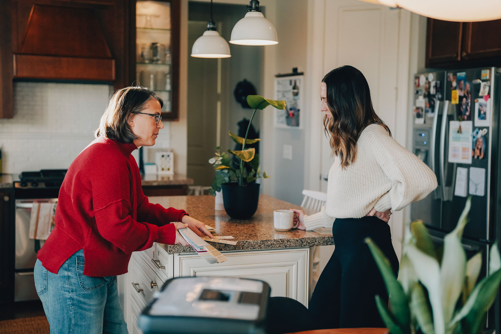
Preventing color disappointments requires a systematic approach that accounts for all the factors affecting color perception and appearance. Professional color consultation begins with understanding your space’s unique characteristics, including lighting conditions, architectural features, existing furnishings, and lifestyle requirements. This comprehensive evaluation provides the foundation for color selections that will work beautifully in your specific environment.
Proper color testing involves much more than looking at small paint chips or even standard paint samples. Professional testing uses large sample areas, typically at least two feet square, applied to the actual surfaces where paint will be used. These samples should be observed under all lighting conditions that affect the space, including natural light at different times of day and all artificial lighting scenarios.
Color rendering index (CRI) evaluation of your lighting helps predict how colors will appear under different illumination conditions. Professional lighting design considers both natural and artificial light sources to ensure optimal color representation throughout the day and evening. This technical approach to lighting evaluation helps prevent the color shifts and disappointments that result from inadequate lighting consideration.
Professional paint specification ensures that color selection is supported by appropriate primer, application techniques, and quality materials. Understanding which primers, sheens, and application methods work best with specific colors and surfaces helps guarantee that finished results match expectations. This technical expertise prevents the quality and application variables that can undermine even perfect color selection.
Avoiding paint color disappointments requires understanding the complex interactions between light, perception, surface characteristics, and environmental factors that affect how colors appear in real-world applications, but navigating these technical considerations doesn’t have to be overwhelming when you work with experienced professionals who understand color science and application expertise. At Headwaters Painting, we’ve helped countless Twin Cities homeowners avoid color disappointments through our comprehensive color consultation process that considers your space’s unique lighting, architectural features, and lifestyle needs to ensure your paint colors look exactly as beautiful as you envisioned. Our team’s expertise in color theory, lighting effects, and professional application techniques eliminates the guesswork and uncertainty that leads to color disappointments, ensuring that your investment in painting delivers the stunning results you expect. Don’t let color confusion and unexpected results compromise your vision for beautiful, professionally painted spaces – contact us today to benefit from our color expertise and professional application services that guarantee your paint colors will look exactly as perfect as you imagined.