The Minnesota real estate market in 2025 reveals fascinating insights about how paint color choices directly impact home sale success, with data showing that certain color decisions can add thousands to sale prices while others create immediate buyer resistance that extends time on market and reduces final offers. Twin Cities real estate agents report that paint color ranks among the top three factors potential buyers notice during initial showings, often determining whether visitors can envision themselves living in the space or immediately dismiss the property as requiring too much work. Understanding which colors drive buyer enthusiasm versus those that create obstacles has become essential knowledge for Minnesota homeowners preparing to sell.
The challenge for sellers lies in distinguishing between authentic market preferences and temporary social media trends that may not translate into actual buyer behavior. While Instagram-worthy accent walls and bold color statements generate online engagement, real estate data from Minneapolis, St. Paul, and surrounding suburbs tells a different story about what actually motivates purchase decisions. Professional staging experts and top-producing agents consistently emphasize that successful home sales depend more on creating broad appeal than expressing individual style, yet many sellers struggle to abandon personal color preferences in favor of market-driven choices that maximize their property’s commercial potential.
Current Market Data on Color Preferences
Twin Cities Multiple Listing Service data from 2024-2025 reveals striking patterns in how different paint colors correlate with sale speed and final prices. Homes featuring neutral color palettes sell an average of 12 days faster than those with bold or highly personalized color schemes, while properties with contemporary neutral finishes receive offers averaging 3-5% higher than comparable homes with outdated or unconventional colors. These statistics reflect buyer psychology that favors move-in ready appearances over properties requiring immediate repainting to match personal preferences.
Regional preferences in Minnesota show distinct patterns that differ from national trends, influenced by local architectural styles, climate considerations, and demographic characteristics specific to the Twin Cities market. Warm gray and greige tones perform exceptionally well in Minnesota homes, particularly those with abundant natural light that counteracts the psychological effects of long winters. Cool blues and greens, while popular in warmer climates, show slower market performance in Minnesota, where buyers gravitate toward colors that create psychological warmth during extended cold seasons.
Price point analysis reveals that color impact varies significantly across different market segments. Luxury homes above $500,000 can accommodate more sophisticated color choices and buyers expect higher-end finishes that might include carefully selected accent colors or premium neutral palettes. Mid-market homes between $200,000-$500,000 show the strongest correlation between neutral colors and sale success, as these buyers often prioritize move-in readiness and broad appeal. Entry-level properties under $200,000 benefit most from fresh, light neutral colors that make spaces feel larger and cleaner.
Seasonal market variations also influence color perception and buyer preferences, with spring and summer buyers showing more openness to diverse color choices while fall and winter buyers demonstrate stronger preferences for warm, cozy neutrals. Minnesota’s peak selling season from April through September coincides with maximum natural light exposure, allowing colors to appear their most flattering and giving sellers optimal conditions for showcasing their paint choices.
The Psychology Behind Buyer Preferences
Understanding buyer psychology helps explain why certain colors consistently outperform others in real estate transactions. Neutral colors create psychological blank slates that allow potential buyers to envision their own belongings and lifestyle in the space, while bold or highly personalized colors require mental work to imagine alternatives. This cognitive load during property viewing can subconsciously influence buyer decisions, making neutral homes feel more immediately comfortable and attainable.
The concept of emotional distancing plays a crucial role in buyer decision-making, where colors that feel too specific to current owners create barriers to psychological ownership. Buyers need to imagine themselves living in the space, and colors that feel strongly tied to someone else’s personality or style preferences interfere with this essential emotional connection. Professional stagers understand this principle and consistently recommend neutral backgrounds that support rather than compete with buyer visualization.
Light psychology becomes particularly relevant in Minnesota’s climate, where buyers subconsciously seek spaces that combat the psychological effects of limited winter daylight. Colors that enhance natural light reflection and create brightness appeal strongly to Minnesota buyers who understand the importance of maintaining positive indoor environments during challenging seasonal conditions. This regional consideration influences why warm whites and light grays consistently outperform cooler color options in local markets.
First impression psychology demonstrates that buyers form opinions about properties within seconds of entering spaces, with color serving as one of the most immediate visual impacts. Colors that create instant positive reactions contribute to overall property perception, while those that require adjustment or explanation can negatively influence entire showing experiences. Understanding these rapid psychological responses helps explain why market data consistently favors colors that create immediate comfort and appeal.
Regional Trends Specific to Minnesota
Minnesota’s unique architectural heritage influences color preferences and market performance in ways that distinguish local trends from national patterns. The prevalence of Craftsman, Colonial, and Prairie-style homes throughout the Twin Cities creates context where certain colors feel more authentic and appropriate than others. Buyers often seek colors that honor architectural integrity while providing contemporary appeal, creating demand for updated neutrals that complement rather than compete with historical design elements.
Climate considerations significantly impact Minnesota color preferences, with buyers prioritizing colors that create psychological warmth and comfort during extended winter periods. Colors that might feel too warm or cozy in southern markets perform well in Minnesota, where creating inviting indoor environments becomes essential for year-round comfort. This climate influence explains why beiges and warm grays consistently outperform stark whites or cool tones in local sales data.
Demographic patterns in Minnesota also influence color preferences, with the state’s educated, environmentally conscious population showing interest in paint choices that reflect sustainability and health considerations. Low-VOC and zero-VOC paint options have become selling points, while buyers increasingly ask about paint quality and environmental impact during property tours. These considerations create opportunities for sellers who invest in premium, environmentally responsible paint choices.
Urban versus suburban preferences within the Twin Cities reveal interesting variations in color tolerance and expectations. Minneapolis and St. Paul urban buyers show slightly more openness to contemporary color choices and accent walls, while suburban buyers in areas like Minnetonka, Edina, and Plymouth demonstrate stronger preferences for traditional neutral palettes. Understanding these geographic nuances helps sellers tailor color strategies to their specific market segments.
Trending Colors That Hurt Resale Value
Gray paint trends that dominated the 2010s have created market saturation that now works against sellers using outdated gray formulations. Cool grays that felt contemporary five years ago now appear dated and cold, particularly in Minnesota’s natural light conditions. Buyers associate certain gray tones with rental properties and flipped houses, creating negative perceptions that impact perceived quality and value.
Bold accent walls, while popular on social media platforms, consistently underperform in real estate markets where buyers prefer flexibility and broad appeal. Dark navy, black, or brightly colored feature walls require significant mental work for buyers to envision alternatives, often creating psychological barriers that extend market time and reduce final offers. Real estate photography also struggles with extreme color contrasts, making properties appear less appealing in online listings where most buyers begin their search process.
Beige tones that were popular in the early 2000s now signal outdated decorating sensibilities that suggest properties haven’t been maintained or updated. Yellow-toned beiges, in particular, create associations with builder-grade finishes and rental properties that negatively impact buyer perceptions of quality and value. These outdated neutrals often perform worse than bold colors because they suggest neglect rather than personal expression.
Trendy colors that gained popularity through home improvement television shows often create negative market reactions when buyers encounter them in real properties. Colors like “millennial pink,” bold turquoise, or trendy green shades that looked appealing on screen translate poorly to actual living spaces and create dated appearances that reduce property appeal. These media-influenced trends typically have short market lives and can quickly transform from contemporary to obsolete.
Timeless Colors That Add Value
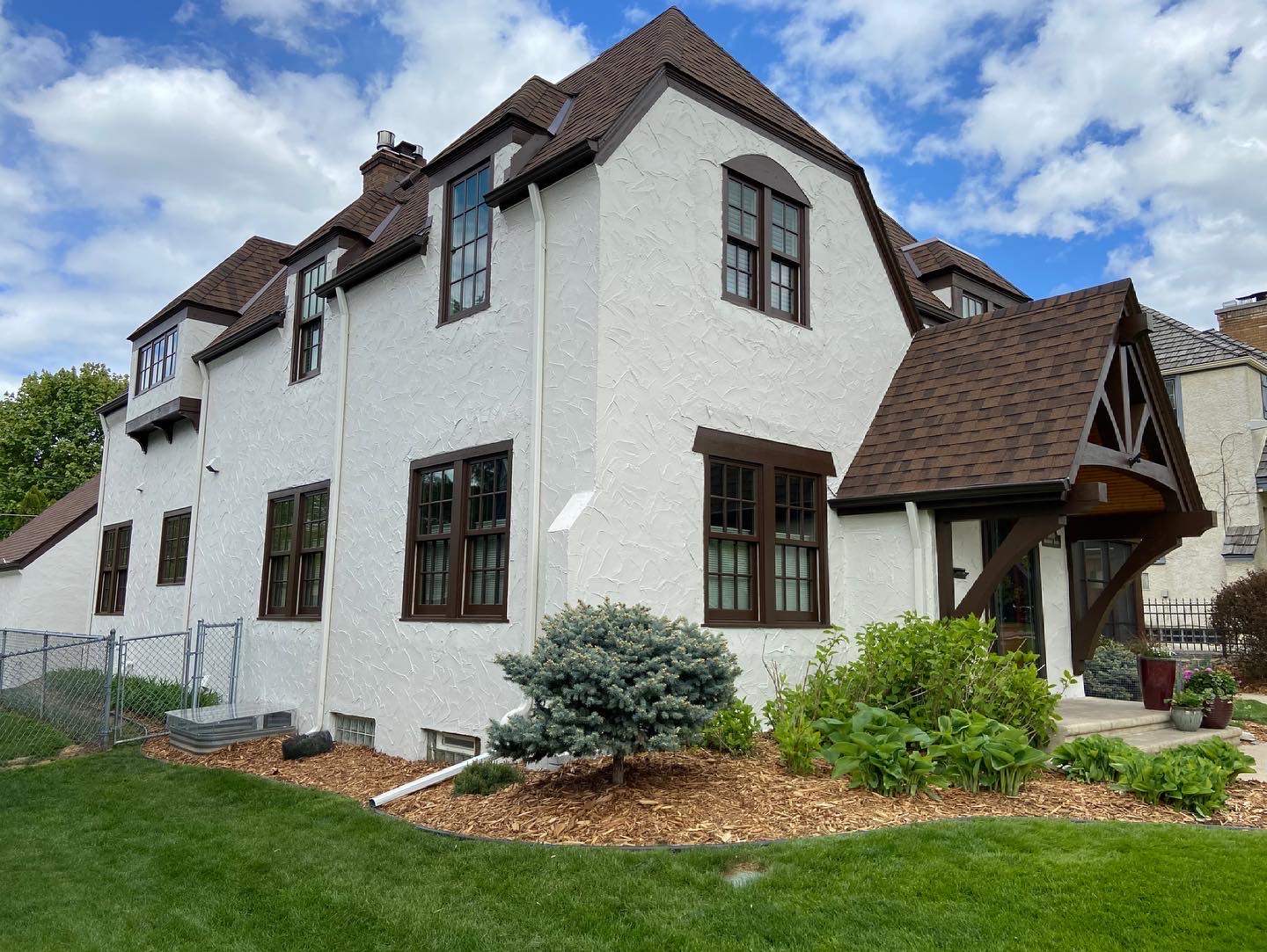
Classic white remains the ultimate safe choice for Minnesota homes, with warm white formulations consistently producing positive market results across all price points and property types. Quality white paint creates clean, fresh appearances that photograph well, enhance natural light, and provide perfect backgrounds for buyers to envision their own decorating choices. However, paint quality becomes crucial with white colors, as inferior products can appear dingy or develop yellow tinting that negatively impacts overall impression.
Warm gray formulations continue to perform well when properly selected for Minnesota’s specific light conditions and architectural styles. The key lies in choosing grays with warm undertones that prevent the cold, institutional feelings that hurt property appeal. Professional color consultation becomes valuable for gray selection, as subtle undertone differences create dramatically different buyer reactions and market performance.
Soft, muted blues and greens can work effectively in Minnesota homes when used strategically and balanced with warm neutrals. These colors perform best in specific applications like powder rooms, bedrooms, or dining areas where they create interest without overwhelming spaces. Market data shows that carefully selected cool colors can enhance property appeal when they complement rather than dominate overall color schemes.
Cream and off-white variations provide warmth and sophistication that appeal to Minnesota buyers while maintaining broad market appeal. These colors work particularly well in homes with abundant woodwork or traditional architectural details, creating backgrounds that enhance rather than compete with existing features. Quality application becomes essential with these subtle colors, as inconsistencies and quality issues become more visible than with deeper hues.
Investment-Focused Painting Strategies
Return on investment analysis shows that strategic painting projects can yield 200-300% returns when executed properly, making paint updates among the most cost-effective home improvements for resale preparation. However, these returns depend heavily on color selection, paint quality, and professional application that creates lasting impressions with potential buyers. Understanding which painting investments provide maximum market impact helps sellers allocate limited budgets for optimal results.
Prioritizing high-impact areas produces better returns than attempting comprehensive repainting on limited budgets. Main living areas, kitchens, and master bedrooms deserve priority investment as these spaces most directly influence buyer decisions and property valuations. Secondary bedrooms and lower-level spaces can often wait unless current colors create significant negative impressions that impact overall property perception.
Professional application becomes increasingly important for investment-focused painting, as quality issues that might be acceptable for personal enjoyment create negative impressions during buyer evaluations. Professional painters understand application techniques, material selection, and quality standards that ensure painted surfaces enhance rather than detract from property value. The incremental cost of professional services often provides significant returns through improved buyer perception and reduced price negotiations.
Timing painting investments strategically within the selling process maximizes their impact while minimizing disruption. Completing painting projects before photography and initial marketing ensures that improved appearances influence all buyer interactions from first online impressions through final negotiations. Rush painting jobs completed after listing often compromise quality and create disruptions that interfere with showing schedules and buyer experiences.
Working with Real Estate Professionals
Collaboration between sellers, real estate agents, and painting professionals creates optimal outcomes for market-focused color selection and application. Experienced agents understand local buyer preferences and can provide valuable guidance about colors that support rather than hinder sale objectives. Their market knowledge helps avoid trendy choices that may not translate into actual buyer appeal in specific neighborhoods and price ranges.
Professional staging consultations often reveal color issues that sellers haven’t considered, providing objective perspectives about how paint choices impact buyer perception and property appeal. Stagers understand how colors interact with furniture, lighting, and architectural features to create overall impressions that influence purchase decisions. Their expertise helps identify which existing colors can remain and which require updating for optimal market performance.
Real estate photography considerations influence color choices in ways many sellers don’t anticipate, as online listing photos serve as first impressions for most potential buyers. Colors that photograph well create advantages in competitive markets where properties must attract attention through digital platforms before generating showing interest. Professional photographers can provide guidance about colors that enhance rather than compromise online presentation.
Successfully navigating Minnesota’s 2025 real estate market requires understanding the complex relationship between paint color choices and buyer psychology, where strategic neutral selections consistently outperform trendy options that may look appealing but fail to drive purchase decisions. The data clearly demonstrates that investment in timeless, professionally applied color palettes provides measurable returns through faster sales and higher final prices, making quality painting one of the most cost-effective improvements sellers can make before entering the market. At Headwaters Painting, we work closely with Twin Cities real estate professionals to help homeowners make color choices that maximize their property’s market appeal while ensuring professional application that enhances rather than compromises sale objectives. Our understanding of local buyer preferences, combined with our expertise in quality application and color selection, provides the strategic advantage that transforms painting from simple maintenance into powerful marketing investment that drives results. When you’re ready to prepare your Minnesota home for sale, contact us to discuss how our market-focused approach to color selection and professional application can help you achieve the fastest sale and highest possible price in today’s competitive real estate environment.