Minneapolis homes are full of rooms that weren’t designed with generous square footage in mind. The bungalows and craftsman houses that define Linden Hills, Seward, and Northeast Minneapolis were built in an era when bedrooms were for sleeping and hallways were for passing through, not for statement design. More recent townhomes and condos throughout the Twin Cities metro compress living space in different ways — galley kitchens with one exterior window, powder rooms that feel more like closets, primary bedrooms where the door swings almost into the foot of the bed. Homeowners in these spaces frequently arrive at the same question: is there anything paint can realistically do to make this room feel bigger?
The answer is yes, but not in the way that most design advice suggests. The conventional guidance — paint it white, paint it light — is so oversimplified that it fails as often as it works, and sometimes produces results that make small rooms feel more confined than the deeper color that was there before. What actually determines whether a paint strategy expands or contracts a room is a more interesting set of perceptual mechanisms involving luminous reflectance, value contrast, sheen geometry, and the way the human visual system interprets spatial boundaries. Understanding those mechanisms gives homeowners a reliable framework for making interior painting decisions rather than a list of rules that only work under the right conditions.
Why “Just Paint It White” Is Incomplete Advice
The logic behind light colors in small rooms is real but partial. Light-value colors reflect more of the ambient light back into the space rather than absorbing it, which increases the overall luminance of the room and reduces the shadow depth at corners, ceiling junctions, and floor transitions. These shadows are what the eye uses to locate the boundaries of a room — when they’re softened, the brain has less precise information about where the walls end, which loosens the perceived envelope of the space. This is the actual mechanism behind why light colors work, and it already points to the first place the “paint it white” advice goes wrong.
The effect depends entirely on how much ambient light the room receives in the first place. A north-facing bedroom in a Minneapolis home during January receives so little natural light that painting it white produces a cold, flat gray appearance — the white is simply reflecting back the cool, low-intensity ambient light available, and the room reads as pallid and dim rather than bright and open. In that same room, a warm off-white with a slight yellow or cream undertone will read as brighter than a cooler true white because it contributes a warmth component that compensates for the cool, diffuse northern light. The warmth creates the perception of luminosity even when the measured light level is identical.
The second problem with pure white in a small room is that it creates high contrast with every element the room contains — dark wood furniture, flooring, textiles, door frames — and that contrast causes those elements to read as visually heavy and forward. A room where the walls are dramatically lighter than everything else in it emphasizes the furniture and fixtures rather than receding behind them, which works against the goal of making the space feel open. A color that is closer in value to the room’s dominant furnishings and flooring reduces this contrast, allowing the walls to visually recede even if the color itself is not particularly light.
Value Contrast and the Boundary Dissolution Effect
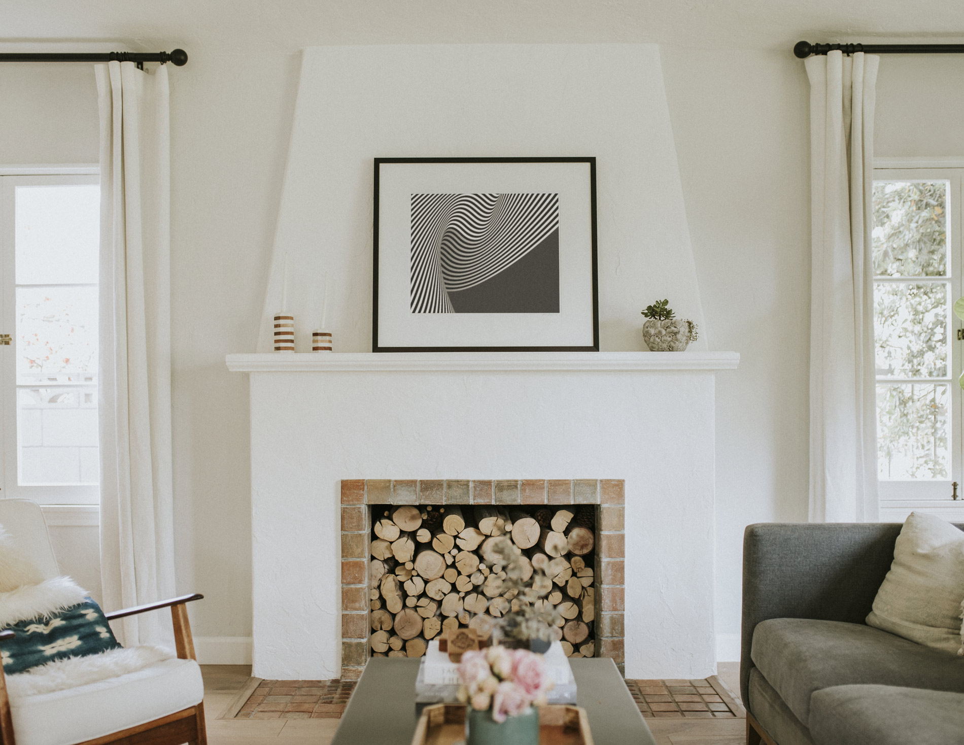
The single most powerful tool in making a small room feel larger through paint is reducing the value contrast between surfaces — specifically between walls, ceiling, and trim. In a typical room painted with white trim, white ceiling, and a wall color in the mid-range, the eye reads three distinct planes defined by the color transitions at their junctions. Those transition lines function as visual boundaries that the brain interprets as spatial edges, reinforcing the sense of enclosure. When those boundaries are softened or eliminated by painting walls, ceiling, and trim in closely related values, the room loses its sharp spatial definition and the perceived envelope expands.
The most effective version of this strategy involves painting walls, ceiling, and trim all in the same color — or in values so close that the transitions between them are only apparent on close inspection. This is called an enveloping or monochromatic treatment, and in a small room it produces a spatial effect that is dramatically more convincing than any light color applied with high-contrast white trim. The room doesn’t appear to have a specific color so much as it appears to be suffused with light, and the boundaries between surfaces become ambiguous rather than defined. The effect works in any value range, though mid-light to light values are most effective in rooms with limited natural light. In a room with a good southern or western exposure, even a medium-value color applied monochromatically to walls, ceiling, and trim can produce an impressively open result.
The Sheen Decision Has More Spatial Impact Than Color
Paint sheen affects perceived room size through a mechanism most homeowners don’t consider: specularity. A flat or matte finish scatters light in all directions uniformly, which makes surfaces appear soft and slightly recessive — they don’t reflect specific light sources back toward the viewer, so they read as farther away. A satin or eggshell finish has a degree of directional reflectance, meaning it reflects a partial image of light sources in the room. This creates micro-highlights on the wall surface that draw the eye and cause the wall to appear slightly forward and more present.
In a small room, the conventional instinct is to use flat paint because it’s forgiving of imperfections — but that ignores the spatial advantage of its matte quality. Flat and matte finishes genuinely make walls recede more than satin finishes, and in a space-constrained room, that recession is valuable. The tradeoff is cleanability, since flat paint marks and scuffs more readily than satin. The practical resolution for most Minneapolis homeowners is to use a high-quality washable matte product — several manufacturers now produce matte finishes with enhanced scrub resistance that approaches eggshell durability — rather than defaulting to satin simply out of maintenance habit.
Ceilings represent a specific sheen opportunity in small rooms that is frequently underutilized. Painting a small room’s ceiling in the same color as the walls but in a flat finish while the walls are in eggshell creates a subtle value shift — the ceiling reads as slightly lighter because the flat finish diffuses more light — that draws the eye upward and increases the perception of vertical space. This ceiling-lighter-than-walls effect can be achieved through sheen selection alone without using two different colors, which preserves the boundary-dissolution benefit of a monochromatic treatment.
Directional Techniques That Reshape Perceived Proportions
Beyond color and sheen, the geometry of how paint is applied and where architectural emphasis is placed can manipulate perceived room proportions in targeted ways. Vertical stripes — even subtle ones achieved through alternating sheen levels rather than contrasting colors — cause the eye to travel upward and increase apparent ceiling height, which makes a room feel less confined even if its footprint doesn’t change. Horizontal treatments do the opposite, widening a narrow room by directing eye movement along the room’s longer axis.
In rooms where the primary problem is low ceiling height — common in older Minneapolis bungalows with eight-foot ceilings — extending the wall color four to six inches above the actual ceiling line onto the ceiling plane, then transitioning to white, creates the visual impression that the ceiling is higher than it is. The eye interprets the color-to-white transition as the ceiling boundary and locates it several inches higher than the actual junction. This technique requires precision cutting at the transition line and is not forgiving of uneven application, which is part of why it tends to produce better results when executed by professionals than when attempted as a DIY project.
The Floor and Trim Color Relationship Nobody Talks About
One of the most overlooked spatial levers in a small room is the relationship between baseboard color and floor color. When baseboards are painted white against a dark floor and mid-toned walls, the high-contrast horizontal band at the base of every wall creates a visual frame around the perimeter of the room at floor level — essentially drawing a box around the space that defines and emphasizes its boundaries. Painting baseboards in a color that is closer in value to the floor rather than to the walls softens this perimeter line and reduces the room’s visual box effect substantially. In rooms where the floor is a medium-toned wood and the walls are a warm mid-light color, baseboards in a warm greige that bridges the two surfaces can make a room feel meaningfully less bounded without any structural change.
Light Direction Determines Which Wall to Treat Differently
In rectangular rooms where making the space feel wider or longer is the goal, the wall opposite the primary light source — typically the wall facing windows — is the most effective surface for a slightly deeper or more saturated version of the room’s color. Because this wall is illuminated most directly, it tolerates deeper color without becoming heavy. The adjacent walls, which receive less direct light, benefit from slightly lighter values that keep them from advancing toward the viewer. This gradient approach — deepest on the light-facing wall, lightest on the walls that flank it — creates a sense of depth that a flat monochromatic treatment doesn’t produce, and it works particularly well in Minneapolis homes where the window placement is fixed and the light direction is consistent.
Ready to Transform a Room That’s Been Frustrating You?
Small rooms have a reputation for being difficult design problems, but the right paint strategy — built around actual perceptual mechanisms rather than generic advice — can change the experience of a space as dramatically as a renovation at a fraction of the cost. At Headwaters Painting, we bring complimentary color consultation to every project, which means you’re not making these decisions alone or from paint chips under fluorescent store lighting. Our color consultant Mary works with Minneapolis homeowners throughout Northeast, Linden Hills, Seward, and the broader Twin Cities metro — including Roseville, Arden Hills, Falcon Heights, and St. Anthony — to find the specific combination of color, value, and sheen that makes your space work for how you actually live in it. If you have a room that’s been bothering you, contact us today to schedule your free estimate. Let’s discover how we can change the look and feel of your space.