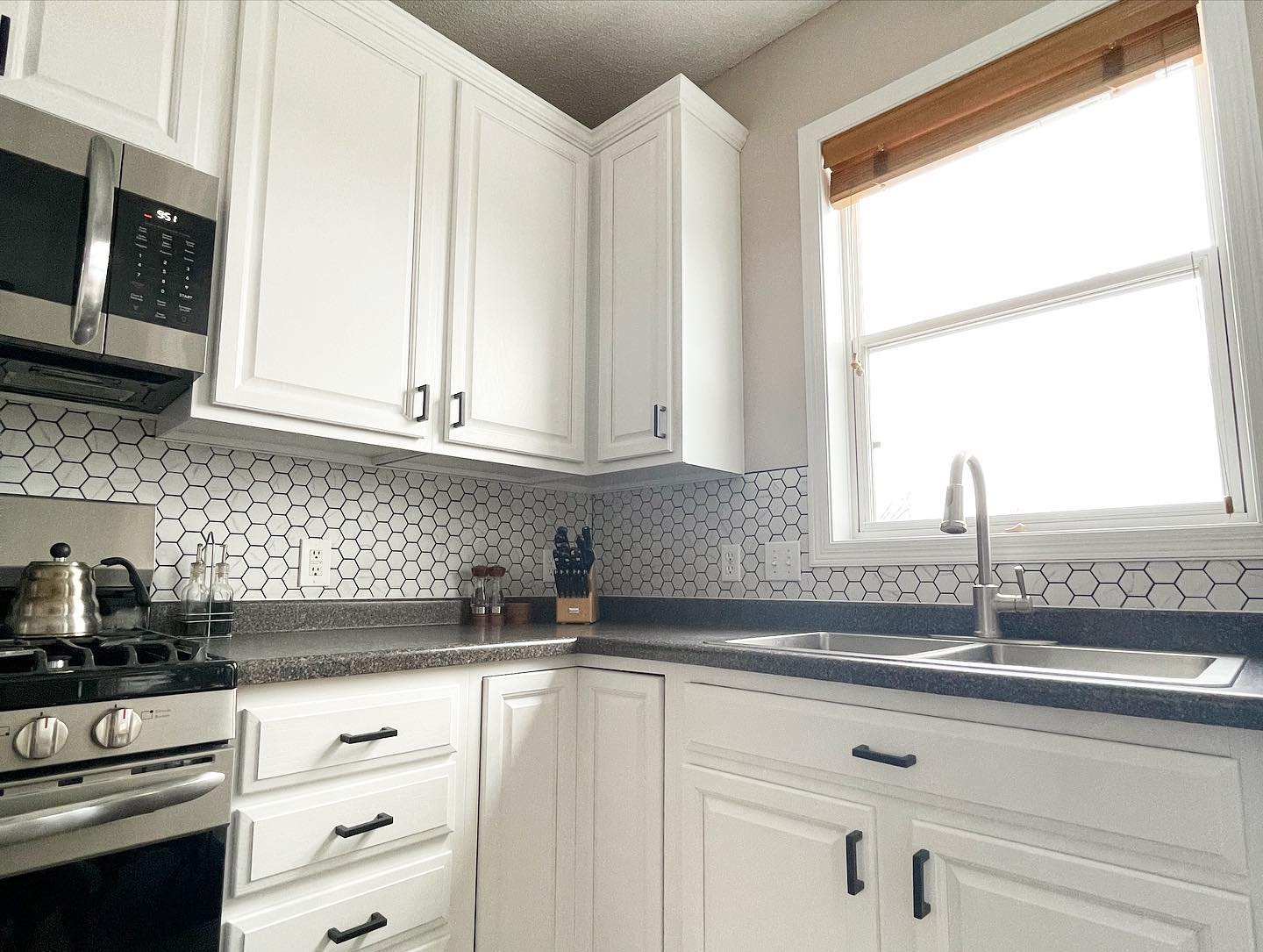
White kitchen cabinets have dominated design magazines and home renovation shows for years, creating an expectation among Minneapolis homeowners that white represents the only sophisticated choice for cabinet transformations. The reality is that while white cabinets offer undeniable advantages in terms of brightness and timeless appeal, limiting yourself to white means missing opportunities to create a kitchen that reflects your personal style while still maintaining strong resale value and broad appeal. The most successful cabinet painting projects in Twin Cities homes often involve homeowners who understood that color choices extend far beyond the safe default of white, and who selected cabinet colors that enhanced their kitchen’s unique characteristics while working harmoniously with Minnesota’s distinctive natural light patterns.
The dominance of white cabinets in contemporary kitchen design stems from legitimate practical considerations rather than arbitrary design trends. White reflects light efficiently, which matters enormously in Minneapolis kitchens where north-facing windows and Minnesota’s extended periods of limited winter sunlight can create spaces that feel darker than comparable kitchens in southern climates. White cabinets also create visual spaciousness that benefits smaller kitchens common in older Twin Cities homes, and they provide flexibility for homeowners who want to experiment with bolder colors in more easily changed elements like wall paint or backsplash tile. These advantages explain white’s enduring popularity, but they don’t justify treating white as the only acceptable choice for professionally painted cabinets.
Understanding Warm Versus Cool Undertones in Cabinet Colors
The distinction between warm and cool undertones matters more in cabinet selection than in almost any other paint choice you’ll make for your home, because cabinets occupy such substantial visual real estate in your kitchen and because cabinet color interacts constantly with countertops, flooring, and appliances that typically can’t be changed without major expense. Warm whites and off-whites contain yellow, cream, or beige undertones that create inviting, cozy atmospheres particularly well-suited to traditional or transitional Minneapolis kitchens with natural wood elements, granite countertops, or warm-toned tile. Cool whites contain gray, blue, or green undertones that produce crisp, contemporary aesthetics that complement stainless appliances, quartz countertops, and the clean-lined cabinetry found in modern Twin Cities renovations.
The challenge in Minneapolis specifically relates to how our northern latitude affects the quality of natural light entering your kitchen. Minnesota receives more blue-toned, cool natural light than southern states, which means warm cabinet colors may appear more neutral here than they would in Texas or Florida, while cool colors can sometimes appear slightly harsh or sterile if you’re not careful with your selection. Testing paint samples directly on your cabinet doors in multiple lighting conditions becomes absolutely essential, because a color that looks perfect in the paint store under artificial lighting may reveal unexpected undertones when illuminated by the specific quality of light your kitchen receives throughout the day.
Gray Cabinet Colors That Avoid Looking Dated
Gray cabinets emerged as the trendy alternative to white roughly a decade ago, creating a situation where many Minneapolis homeowners now worry that gray feels dated or overly trendy. The truth is more nuanced than the all-or-nothing perspective suggests. Certain gray tones, particularly those with cool blue-gray undertones that gained popularity in the mid-2010s, do increasingly look like products of a specific design moment. However, sophisticated gray-greens, warm greiges that bridge gray and beige, and soft, neutral grays with balanced undertones continue to deliver timeless appeal that works beautifully in Minnesota kitchens.
The key to selecting gray cabinet colors that won’t feel dated in three years involves avoiding extremes in either temperature or saturation. Very cool grays with strong blue undertones, which were incredibly popular during the height of the gray trend, now feel distinctly of their moment and increasingly dated. Similarly, very dark charcoals can feel heavy in Minnesota kitchens where natural light is already at a premium during winter months. Instead, look for midtone grays that read as genuinely neutral, or gray-greens like sage or eucalyptus tones that bring subtle color without announcing themselves as trendy choices. These balanced grays provide the sophistication many homeowners seek when moving away from white while avoiding the trap of selecting a color so obviously trendy that it dates your kitchen.
Two-Tone Cabinet Strategies for Minneapolis Kitchens
Two-tone cabinet painting represents one of the most effective ways to introduce color into your kitchen while maintaining the brightness and versatility that white cabinets provide. The most successful two-tone strategies in Twin Cities homes typically involve painting upper cabinets in a light neutral color, often white or a soft warm white, while selecting a more saturated color for lower cabinets or a kitchen island. This approach maintains visual lightness at eye level where it contributes most to perceived spaciousness, while grounding the kitchen with deeper color in lower cabinetry where it creates visual weight and anchors the space effectively.
The color selection for your darker cabinets matters enormously, and Minneapolis homeowners should consider how their choice interacts with the specific countertop materials common in Twin Cities renovations. If you have white or light gray quartz or marble countertops, navy blue lower cabinets create sophisticated contrast without overwhelming the space, while sage green or dusty blue-green tones offer softer alternatives that feel both current and timeless. For homeowners with warmer granite or butcher block countertops, consider forest green, deep charcoal, or even warm chocolate brown for lower cabinets, all of which complement warm-toned natural materials beautifully.
Navy and Deep Blue Cabinet Colors in Minnesota Homes
Navy cabinets have proven themselves as legitimate long-term alternatives to white in ways that many trendy colors haven’t, largely because deep blues possess the visual weight and sophistication that kitchens require while maintaining enough neutrality to work with diverse design elements. In Minneapolis kitchens specifically, navy cabinets offer particular advantages because they read as elegant and intentional rather than experimental, they hide wear and minor imperfections better than white cabinets, and they create dramatic impact without the maintenance concerns associated with very light cabinet colors in households with children or heavy kitchen use.
The challenge with navy cabinets in Minnesota relates primarily to ensuring adequate lighting, because navy absorbs rather than reflects light. This makes navy a better choice for kitchens with abundant natural light from south or east-facing windows, or for homeowners willing to invest in comprehensive under-cabinet and ambient lighting to maintain brightness. Navy works particularly well in two-tone applications where upper cabinets remain white, or in kitchens with white or very light countertops that provide visual relief from the deep color. When selecting navy for cabinet painting, look for true navies rather than colors with heavy purple or gray undertones, because these subtle shifts in base tone significantly affect how the color reads in the varied light conditions your Minneapolis kitchen experiences throughout the day and across seasons.
Green Cabinet Colors Beyond Basic Sage
Green kitchen cabinets have evolved considerably beyond the basic sage tones that dominated the late 2010s, opening opportunities for Minneapolis homeowners seeking colors that feel both current and enduring. Deep forest greens bring sophistication and richness particularly well-suited to kitchens in older Twin Cities homes where traditional architectural details support bolder color choices. Olive greens with brown undertones create warmth and earthiness that complements natural wood flooring and warm-toned granite beautifully. Eucalyptus and gray-green tones offer softer alternatives that work in contemporary and transitional spaces without feeling overly trendy.
The key to successful green cabinets involves matching the color’s intensity to your kitchen’s natural light conditions and overall aesthetic. Lighter gray-greens and sage tones work well in kitchens with limited natural light or in spaces where you want color without drama. Deeper forest and emerald greens deliver high impact but require adequate lighting and suit larger kitchens where the color won’t feel overwhelming. When selecting green cabinet colors for your Minneapolis kitchen, pay particular attention to how the color appears under LED versus natural lighting, because greens shift significantly between artificial and natural light sources in ways that blues and grays typically don’t.
Black and Charcoal Cabinets: Making Dark Work in Minnesota
Very dark cabinet colors, particularly true black or deep charcoal, represent the boldest departure from white while delivering undeniable sophistication when executed properly. In Minneapolis kitchens, dark cabinets face the challenge of working within light constraints that don’t exist in southern climates, which means dark cabinet success depends heavily on your kitchen’s specific characteristics. Dark cabinets work best in kitchens with excellent natural light from multiple exposures, in larger kitchen spaces where dark cabinets won’t make the room feel cramped, and in homes where homeowners are committed to professional lighting design that maintains functionality and prevents the space from feeling cave-like.
The most successful dark cabinet installations in Twin Cities homes typically incorporate several key strategies: pairing dark lower cabinets with white or light upper cabinets to maintain visual lightness, selecting countertops in light colors that create strong contrast and reflect light, installing extensive under-cabinet lighting to illuminate work surfaces properly, and ensuring the kitchen connects visually to adjacent spaces through open sightlines that borrow light from other rooms. When you implement these strategies thoughtfully, dark cabinets create drama and sophistication that white cabinets simply cannot match, transforming your kitchen into a genuine design statement rather than a safe but unremarkable space.
Evaluating Color Against Your Existing Kitchen Elements
The most critical factor in cabinet color success isn’t the color itself but rather how that color interacts with the elements in your kitchen that aren’t changing during your cabinet painting project. Your countertops, flooring, and backsplash establish fixed parameters within which your cabinet color must work, and failing to account for these relationships guarantees disappointment regardless of how beautiful your chosen cabinet color might be in isolation. Homeowners with busy granite countertops featuring multiple colors need cabinet colors that don’t compete for attention, which typically means neutrals or single-note colors rather than complex tones. Homeowners with simple solid-surface countertops have more flexibility to introduce complex cabinet colors because the countertops provide visual simplicity that balances cabinet interest.
Your kitchen’s flooring similarly constrains cabinet color selection in ways many homeowners overlook until paint is already on the cabinets. Warm wood flooring generally pairs better with warm cabinet colors or neutral whites, while gray-toned flooring supports cool cabinet colors effectively. When your flooring and countertops have different temperature tones, your cabinet color needs to bridge that gap rather than favoring one side exclusively, which often points toward neutral grays or greiges that contain both warm and cool elements. The most reliable approach involves taking actual samples of your countertop and flooring to the paint store and evaluating cabinet color samples against these materials under various lighting conditions before making final selections.
The Test Sample Process for Cabinet Color Selection
Selecting cabinet colors requires a more rigorous sampling process than wall color selection, primarily because the financial investment and labor involved in cabinet painting makes mistakes far more costly to correct. Order sample sizes of your top three to five color choices and paint them directly onto cabinet doors or large pieces of primed board rather than relying on small paper samples. View these samples in your actual kitchen environment at different times of day, because morning light differs substantially from afternoon light, and artificial evening lighting reveals different characteristics than natural daylight. Live with your samples for at least a week, observing how the colors make you feel when you walk into your kitchen at various times and considering whether the color continues to appeal or begins to feel like a mistake.
Pay attention to how your sample colors look against your countertops at the precise point where countertop and cabinet meet, because this intersection creates one of the most important color relationships in your kitchen. Notice whether the cabinet color makes your countertops look better or worse, whether it emphasizes or minimizes any aspects of your countertops you wish were different, and whether the overall effect feels harmonious or discordant. The investment in proper sampling prevents expensive regrets and helps you move forward with confidence that your chosen color will deliver the transformation you’re envisioning.
Your Minneapolis kitchen deserves cabinet colors that reflect your personal aesthetic while respecting the practical realities of Minnesota living and the fixed elements already present in your space. The cabinet painters who understand color theory, who can guide you toward choices that will work specifically in Minnesota’s light conditions, and who have the technical expertise to deliver flawless results make all the difference between a cabinet painting project you’ll love for years and one that becomes a source of daily regret. We’ve transformed countless Twin Cities kitchens through professional cabinet painting that goes beyond basic white to create spaces that feel both timeless and personal. Contact Headwaters Painting today to schedule your free consultation and discover how the right cabinet colors can completely transform your kitchen’s character and your daily experience of the heart of your home.