There is a category of interior paint color problem that stumps homeowners more than almost any other: you tested the color carefully, you liked the sample, you painted the room, and the color is still wrong — but you can’t quite explain why. It’s not dramatically wrong. It just doesn’t look the way it did in the inspiration images, or the way it looked on the wall at your friend’s house, or even the way it looked in the same room three hours ago when the light was different.
The answer, in most of these cases, comes down to one variable that almost nobody factors into color decisions at the beginning of a project: which direction the room faces. The orientation of your windows — whether they look north, south, east, or west — determines the quality, temperature, and intensity of the light entering that room, and those light characteristics directly control how every paint color in the room reads. A color that behaves beautifully in a south-facing room can look cold and uninviting in a north-facing one. A color that seems warm and grounded in a west-facing space can look harsh and saturated in an east-facing room during morning hours.
In Minneapolis, this directional effect is amplified by something that paint color guides written for national audiences almost never address: the dramatic seasonal variation in sun angle and day length that comes with the city’s northern latitude. The light entering a north-facing Minneapolis bedroom in January is genuinely different in character from the light entering that same room in July — different color temperature, different intensity, different angle of entry — and a color chosen without accounting for both conditions will behave unexpectedly for half the year. For Minneapolis homeowners who spend five months of the year living primarily under artificial light with minimal daylight hours, this seasonal dimension of color behavior is not a secondary consideration. It is often the primary one.
What Light Direction Actually Does to Color
To understand why orientation matters so much, it helps to understand what happens to light as it enters a room from different compass directions. Light is not uniform — it varies in color temperature, meaning the relative warmth or coolness of its spectral composition, and that variation determines which undertones in a paint color are amplified and which are suppressed.
Direct sunlight carries a warm, slightly yellow-orange quality that shifts as the day progresses. Morning sun coming through east-facing windows is cooler and more golden. Afternoon sun through west-facing windows is the warmest and most amber-tinted of the day. South-facing rooms receive the most direct, intense light and the most neutral representation of colors across the daylight hours, though even south light shifts from cooler in the morning to warmer in the afternoon. North-facing rooms receive no direct sunlight at all — only reflected skylight, which carries a distinctly cool, blue-shifted quality that reads as the most neutral and consistent light of any orientation but is also the coolest and most unforgiving of any paint color with warm undertones.
Every paint color has undertones — secondary hues embedded in the formulation that interact with the light source illuminating the surface. Warm light sources amplify warm undertones (yellows, oranges, reds) and suppress cool ones. Cool light sources do the opposite, suppressing warm undertones and amplifying cool ones (blues, greens, violets). This is why a paint chip that looks like a warm, creamy white in the store reads as distinctly cool and gray in a north-facing room — the blue-shifted skylight entering from the north is suppressing the yellow undertone that made the color look warm under store lighting, and amplifying the cool undertone that was barely visible before.
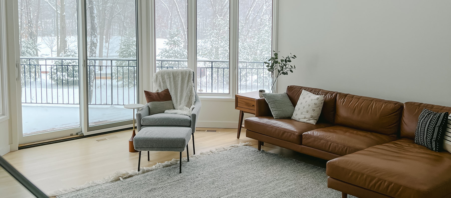
North-Facing Rooms: Where Warm Undertones Are Your Most Reliable Tool
North-facing rooms in Minneapolis homes are the most challenging spaces for paint color, and they require a different selection strategy than any other orientation. Because they receive only reflected skylight — the coolest and most blue-shifted natural light available — any paint color with a cool undertone will read significantly cooler in a north-facing room than it did under warmer test conditions. Cool grays become blue-gray. Greige leans green. Soft whites read almost lavender or silver. Colors that looked balanced and refined on a swatch or a sample board under neutral store lighting arrive on the north-facing wall and feel cold, slightly clinical, or simply off in a way that is hard to identify but immediately felt.
The solution for north-facing Minneapolis rooms is to choose colors with warmer undertones than instinct says to use — deliberately compensating for the blue shift that the light will apply. A color with a yellow or orange-adjacent undertone that seems slightly too warm under neutral test conditions will often land as a balanced, grounded neutral in a north-facing room where the cool skylight neutralizes that warmth to exactly the right degree. Soft warm whites, creamy off-whites, warm taupes, and yellow-leaning greens are reliably better performers in north-facing rooms than the cool versions of those same color families. The goal is to select a color whose undertone, when filtered through the cool quality of north light, arrives at the balanced appearance you’re actually trying to achieve.
South-Facing Rooms: The Most Forgiving Orientation — With One Specific Trap
South-facing rooms in Minneapolis homes receive the most direct and consistently neutral natural light of any orientation, which makes them the most forgiving spaces for color selection. Most colors behave close to their chip appearance in a well-lit south-facing room during the middle of the day, because the light quality is closest to the neutral conditions under which colors are photographed, printed, and displayed in stores and inspiration images. This is why south-facing rooms tend to produce the fewest color surprises — the light isn’t doing unexpected things to the undertone, and the color largely reads as intended.
The specific trap in south-facing Minneapolis rooms is the seasonal one. In summer, when the sun is high in the sky, south-facing windows receive abundant direct light that floods the room. In winter, when the sun angle drops dramatically at Minneapolis’s latitude, south-facing rooms receive low-angle direct sun that enters the window at a much shallower trajectory — hitting the floor and lower walls rather than distributing evenly through the space. This low winter light is warmer and more amber-tinted than summer light, and it amplifies the warm undertones in wall color in a way that the same room in July never does. A warm neutral that looks perfectly balanced in June can read distinctly orange or pink by December, particularly in the late afternoon when the low winter sun is at its most amber-tinted.
For south-facing rooms where year-round color performance matters, testing sample patches in both summer and winter lighting conditions is the most reliable approach. If winter testing isn’t possible before committing to a color, selecting neutrals with slightly cooler or more gray-adjacent undertones than instinct says to use provides insurance against the warm amplification that winter sun will apply.
East-Facing Rooms: Getting Morning Right
East-facing rooms receive direct morning sun and indirect light for the rest of the day, which creates a split personality that color selection needs to account for. During the morning hours when direct sun enters from the east, colors read with a warm golden quality and strong illumination that makes everything look more saturated and luminous. By afternoon, when direct sun has moved away, the same room transitions to indirect, cooler light and the same colors read noticeably more subdued and slightly cooler.
In Minneapolis, where east-facing bedrooms and breakfast rooms are the rooms many homeowners start their day in, the morning light quality is often the one that matters most for daily experience. Colors that look great under the warm morning sun — rich, lively, clear — and then soften into something quieter in the afternoon can work very well in east-facing spaces where the daytime use pattern follows that arc. Colors that look acceptable in the afternoon light but are too saturated or intense under the morning’s warm direct sun tend to be more problematic, because the morning condition is harder to ignore when you’re in the room every day before 9 a.m.
West-Facing Rooms: The Warmest Light Challenge
West-facing rooms present the inverse of the east-facing situation and the most intense version of the warm-light amplification problem. These rooms receive their direct sun in the late afternoon — the period when sunlight is at its warmest, most amber-tinted quality of the entire day — and relatively cool, indirect light in the morning and midday hours. Any warm undertone in a paint color applied to a west-facing room will be dramatically amplified during the afternoon hours, and colors that seemed safely neutral during morning testing can become unexpectedly orange, pink, or yellow when the afternoon sun floods in.
This is compounded in Minneapolis during summer, when late afternoon sun is both intense and warm, and the west wall receives the most sustained direct heat and UV exposure of any surface on the exterior. West-facing rooms in Minneapolis that are used primarily in the afternoon — home offices, living rooms, sunrooms — require the most conservative undertone selection of any orientation. Colors with gray or blue undertones that would read cold in a north-facing room often perform as balanced neutrals in a west-facing space specifically because the warm afternoon light neutralizes the cool undertone to a middle ground.
The Minneapolis Seasonal Shift That Changes Everything
All of the directional principles described above are modified, sometimes dramatically, by the seasonal light variation that Minneapolis’s latitude produces. At approximately 45 degrees north latitude — roughly halfway between the equator and the North Pole — the sun’s angle above the horizon varies by more than 46 degrees between the winter solstice and the summer solstice. That variation means that in late December, the sun never rises much above 22 degrees above the horizon at midday, while in late June it reaches nearly 68 degrees. This enormous swing in sun angle affects not just how much light enters a room but the direction from which it enters, how deeply it penetrates, and what color temperature it carries.
For Minneapolis homeowners choosing paint colors, the practical implication is that any room receiving direct sun will behave significantly differently in January than it does in July — and a color that performs beautifully during the season when you’re choosing it may surprise you in the opposite season. The rooms where this seasonal shift matters most are south-facing rooms (which experience the greatest change in sun angle between seasons), west-facing rooms during the afternoon, and any room with large windows where seasonal penetration depth changes dramatically. Testing colors through both warm-season and cold-season conditions, or at minimum evaluating sample patches while deliberately imagining the room under the opposite season’s light, is the most reliable way to avoid a color that works in summer and bothers you from November through April.
We Can Help You Choose Colors That Work All Year
Paint color decisions made without accounting for orientation and seasonal light are color decisions made with incomplete information — and in a city where the light conditions change as dramatically as they do in Minneapolis between January and July, that incomplete information produces more color surprises than in almost any other market. At Headwaters Painting, we help homeowners throughout Minneapolis and the Twin Cities navigate exactly these room-specific, orientation-specific, season-specific decisions before any paint is committed to a wall. Whether you’re working through a challenging north-facing room that eats every color you try, a west-facing space that turns orange every afternoon, or an entire home where you want a palette that performs well in both summer and winter light, we’re ready to help. Contact our team today to schedule your free estimate and consultation — and let’s get the color right for your specific rooms, your specific orientation, and all twelve months of the year.